I had a conversation with a client this week about a website they are creating. They were worried that it wasn’t interesting or eye catching enough and they felt that they should be doing more. It reminded me of my time at big brands where the senior brand guardians could sometimes review websites through the same lens. It is obviously very important to keep a consistent brand feel but the key thing, when you are signing off anything, is to do it in the context of its purpose and use. I’ve been in situations where I’ve ended up with a web page that looks beautiful and would be great as a double page spread in a magazine, but as a website it is far less than it could have been. No logical places to click for more information, no easy swipe functionality on mobile etc. Websites give us the opportunity to take consumers further into our brands if we use them in the right way.
One of the brilliant advantages of the new world of digital is that we are able to serve the user far better and we should always keep their experience top of mind. A website is often a step in the journey of a user, not a first port of call – they have come there through search or from a press ad or a link on a social network. Those areas are where you need to ‘catch people’s eye’ or more appropriately, their attention. You can do this with relevant messaging and, in search, accurately responding to their query.
Once people land on your site, you need to ask yourself why are they there? Most probably to get an answer to a question, find out more about your offering or transact with you. So what is important? That it loads quickly, that they can find what they are looking for, that your content is relevant and that they can achieve what they set out to do. Obviously you want the site to look good, have a quality feel and reflect your brand values but you don’t need gimmicks for gimmicks’ sake. Think of your website like a boat (like our logo) you don’t want to slow it down with the weight of things that make it look nice but serve no purpose, you want to be able to speed ahead to your destination and cope with every eventuality at sea.
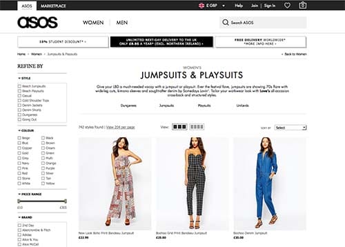
Think of sites that you regularly use – Google for example – it is a simple design that enables you to do what you came to do, search. The best ecommerce sites are also very simple in their design Amazon, asos, eBay – they don’t have whizzy animations, they let their products be the hero and only add elements such as filters, reviews or catwalk videos where it will help the user to make their decision. Sites like Twitter and Facebook have made users even more used to using simple sites where their content is what populates it and makes it interesting.
If you want to make sure that your site is engaging and eye catching, invest your time in thinking about and planning your content rather than creating widgets that just look pretty.


